Inspiration
Records or Dentist Logo
I chose this logo because I thought it looked interesting and the colors caught my eyes their main focal point are the words that are bolded so the message got across and I think it looks trustworthy and simple.
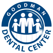
This logo was for dentistry and it caught my attention because it looks simple and friendly which is important because not a lot of people feel safe or comfortable in at the dentist. And the logo is simple enough to recognize what company it is representing because the teeth and the family.
This logo is for a record company and I liked it because it looks professional and simple something that I can trust and remember.
I chose this logo for dentistry because it looked memorable and just pleasing to look at. I liked that they incorporated the tooth fairy because kids go to the dentist a lot and the adults can see that it is a safe family friendly dentist.
Inspiration/Brainstorm
I want to create a logo that is simple yet interesting enough so that the viewers can stop and actually want to look at it and want to know what kind of company it is representing. My ideal logo is for it to be somewhat a small size and unique, simple, and professional. For the age group, I would consider my logo to be for young adults and older adults around the ages of 15-30.
Research
Logos can be traced back to ancient Greek times, but the more modern type of logos started around the 13th century. As time passes the logos change too, as the world modernizes the logos get more simple and easy to recognize. The apple logo was first a a bottle with Isaac Newton underneath an apple tree, then it changed to a bitten apple with rainbow colors, then a black apple, then present day, a silver apple.
Trends
Since 2011-2012 the color trends have changed drastically. Usually people would prefer subtle colors even for fashion and colors that go well together like complementary colors but in the year 2012 the color trends vary from subtle simple colors to bright turquoises, light pink, all shades of blue, and light yellows that compliment blues or even reds. Nowadays our logos have more of a modern twist to them so that people will follow with the trend, it keeps the audience interested to make logos more modern but still the same idea so that the audience know that its not another company.


No comments:
Post a Comment