Monday, May 7, 2012

Assignment #20 Creative Process

This is a good example because it includes a lot of principles and it looks appealing and professional.


I also liked this because it used the same principles as the Obama campaign poster and I think that because the idea of the Obama poster was popular he made it look like it so that it will catch peoples eyes.

Photo Psychology


Tuesday, April 24, 2012

Assignment # 19 Creative Process

This business card caught my attention because of its uniqueness and simplicity. The designer used green on black so that the green circle would pop out and he was creative by using the O as a camera lense.


I liked this card because it looked appealing and simple. It is very memorable and the simplicity will help people remember what the business is. Even though its not the usual shape of a card it can still be held in wallets without falling out or not fitting. And I also like the individuality of it and the uniqueness of the design and it looks like a trustworthy company.


Research
Business cards are very important to companies because the way it looks and speaks to people determine wether or not the people will trust or want the companies help. A business card can say a lot about you, like if it is generic and plain, the targeted audience will not want to keep your card or use a company that is not individual and creative. A business card must have the number of the company, your number possibly, an address to your company and website or email, you also need the business name and employer. Being too creative with you card can also be bad because if you decide to change the shape or size of a normal card the people will not have place to put it in their wallet and results in them throwing it away or not picking up your business card.

Stationary Package

-The printed pieces that a company utilizes for communication purposes.
-When establishing a business, it is very important that all communications are well coordinated and the the message of the organization is presented consistently.
-Includes business cards, letterhead, and envelope
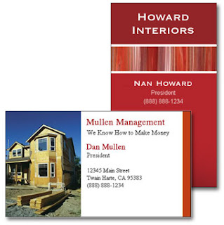

Business Card
-An essential part of a stationary design. When you hand someone your business card, they will form an immediate opinion about your company. Your business card does more than tell people how to find you: it says something about your company- its your mission, its culture, and its goals. Everything from the colors, fonts, the texture, shade, and gloss of the paper you print says something about you.


Typically includes
-logo
-company name
-employee name
-title
-phone number
-fax number
-email address
-company address
-web address


Design Tips
-must be 2''x3.5''
-horizontal Or vertical orientation
-check for accuracy
-check for unity..continuity among other pieces
-typical margin is .25'' to .125''


Letterhead
-a printed piece of paper used to send pictures on business card
typically includes:
-logo
-company name
-company address
-phone number
-fax number
-web address


Design tips
-must be 8.5"x11" (standard)
-must be vertical orientation
-must leave room to write the letter, memo, etc-big empty space in middle
-check for accuracy
-check for unity..continuity among other pieces


Envelope
-the packaging that contains the letter/form when being mailed
-standard #10 envelope

typically includes:
-logo
-company name
-company address

Design tips
-must be 9.5"x4.125"
-horizontal OR vertical orientation
-must leave room for the recipients address and stamp
-check for accuracy
-check for unity..continuity


Thursday, April 19, 2012

Assignment # 18 Inspiration & Research

 This lettermark caught my attention because of the colors and creativity. They used PANTONE colors and the two R's represent a carrot with a stem on the top and it makes the logo memorable and gives us a hint that maybe it is for children and not adults because of the babylike colors.
 This lettermark is of Ebay and I think it is unique and simple but memorable. Instead of just placing the letters on top of each other they added interest by letting the letters on the bottom show up in a shadow and the size difference makes it more interesting to look at and creates movement.
 This lettermark caught my attention because it looked professional and clean, it looks like a trustworthy company and the I that is horizontal adds interest and curiosity which makes the viewer a little more interested to find out what the company represents.
This logo was very interesting and creative because the first letter T is colored so that the red goes along the left side of the T and it is creative because the companys logo it TURNLEFT and the T looks like a road and the red line is going towards the left. And the colors are complementary which shows that the company is profession like, using colors that appeal to the older age groups of 20 and up.


Lettermarks and Wordmarks
lettermarks and wordmarks are different types of logos, instead of having a picture of a logo or a picture with the company, lettermarks only show the companys name. Because it only shows the name, designers usually have to be a little more creative to catch the attention of peoples eyes with words not pictures. Designers usually focus on the font of the letters and how they can utilize the letters to create a picture within the letters that have to relate to the company.

Friday, April 13, 2012

Assignment #17 Inspiration & Brainstorm

Inspiration
Records or Dentist Logo
I chose this logo because I thought it looked interesting and the colors caught my eyes their main focal point are the words that are bolded so the message got across and I think it looks trustworthy and simple.


This logo was for dentistry and it caught my attention because it looks simple and friendly which is important because not a lot of people feel safe or comfortable in at the dentist. And the logo is simple enough to recognize what company it is representing because the teeth and the family.


This logo is for a record company and I liked it because it looks professional and simple something that I can trust and remember.


I chose this logo for dentistry because it looked memorable and just pleasing to look at. I liked that they incorporated the tooth fairy because kids go to the dentist a lot and the adults can see that it is a safe family friendly dentist.


Inspiration/Brainstorm
I want to create a logo that is simple yet interesting enough so that the viewers can stop and actually want to look at it and want to know what kind of company it is representing. My ideal logo is for it to be somewhat a small size and unique, simple, and professional. For the age group, I would consider my logo to be for young adults and older adults around the ages of 15-30.

Research
Logos can be traced back to ancient Greek times, but the more modern type of logos started around the 13th century. As time passes the logos change too, as the world modernizes the logos get more simple and easy to recognize. The apple logo was first a a bottle with Isaac Newton underneath an apple tree, then it changed to a bitten apple with rainbow colors, then a black apple, then present day, a silver apple.


Trends
Since 2011-2012 the color trends have changed drastically. Usually people would prefer subtle colors even for fashion and colors that go well together like complementary colors but in the year 2012 the color trends vary from subtle simple colors to bright turquoises, light pink, all shades of blue, and light yellows that compliment blues or even reds. Nowadays our logos have more of a modern twist to them so that people will follow with the trend, it keeps the audience interested to make logos more modern but still the same idea so that the audience know that its not another company.